less than a minute read • Updated
Manage product variants with Framer CMS (Advanced)
Use Framer CMS to manage variant groups, options and more.
Note
This article assumes you have already set up a Products CMS Collection and add to cart forms in Framer. More information here.
Overview
By using Foxy and Framer CMS to manage products and product variants, you'll be able to add product variants and additional power features to your Framer setup.
This approach consists of two CMS collections. One collection for products and another collection for product variants. The two are connected with a multi-reference field.
Features
The following features are supported (more in the works):
Multiple levels of variant groups
Select field and radio buttons
Dynamically styled radio buttons
Chained variant functionality
Per variant combination inventory control
Real-time image change
Real-time price change
Real-time SKU change
Objectives
In this article, we'll accomplish the following:
Create a product variants collection in Framer CMS
Reference product variants from the products CMS collection
Set up variant group elements, select fields, and radio buttons in add-to-cart form
Configure variant snippet settings
Demo
Live demo: https://foxy-commerce.framer.website/
Project link: https://framer.com/projects/Foxy-Commerce--zFGUinN6jk8hQow5Qphs-idFSx
Remix link: https://framer.com/remix/ckrX1pb7bbmSgyVM7ZzR
Create Variants CMS Collection
An additional CMS collection is needed to store product variant data. Once you've created this additional CMS collection and have added data, you should have a CMS item for every possible product variant combination (ie: Awesome Shirt / Blue / Large).
Configure Add To Cart Form
You should have already set up add-to-cart forms following this article, which adds a product name and price fields at the minimum. To enable dynamic variants, you'll also need to add a product code (SKU) field:
If you need per-variant inventory control, follow the steps below:
Add Variant Option Fields to the Form
Our variant functionality supports select fields and radio buttons (default and custom). All variant groups can use the same field type, or you can mix them as needed (ie: Color uses radio buttons, Size uses select field).
Select Field
Select fields are recommended for variant groups with many options and/or that don't need option specific styling.
Add Code Overrides to Elements
Apply the following code overrides to elements if you need real-time price, image or inventory display.
Price
Image
Inventory
Add Variant List Element
Click the insert element button.
Choose Fields > Variants (the multi-reference field that contains available variants).
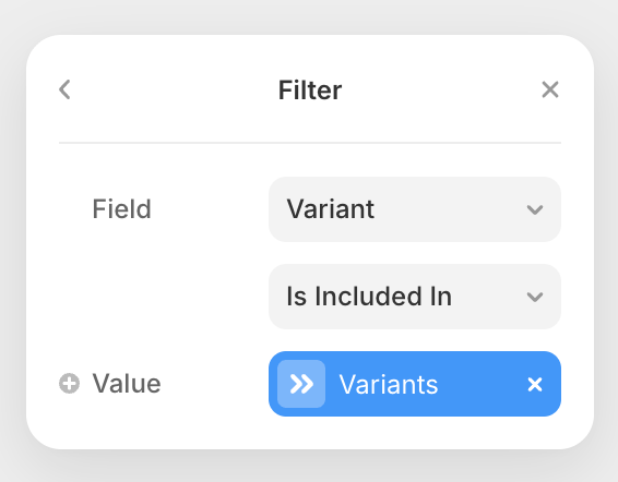
Add a filter to the variant list element (under Content in element settings).
Configure the filter as the image below. For the Value field, set variable to the Variants field.
Place the variant list element anywhere on the Products Template Page. This element will be hidden with a code override (applied in the next section) on the published site. Don't set its visibility to none.
Configure Variant Item Element
Add Variants Script
The variants script handles all the needed logic to make the variants functionality work.
<!-- FOXY VARIANTS -->
<script src="https://cdn-js.foxy.io/website-helpers@1/foxy-variants.js"></script>
<script>
  (() => {
    const config = {
      sortBy: "",
      sortOrder: "",
      priceDisplay: "low-high",
      pricePrecision: "2",
      defaultLocale: "en-US",
      defaultCurrency: "USD",
      inventoryControl: false,
      inventoryDefaultLabel: "Configure options for availability",
      selectUnavailableLabel: "Unavailable",
      forceReinit: true,
      adapter: ({ container, config, log }) => {
        document
          .querySelector('[data-foxy-product="form"]')
          .setAttribute('foxy-id', 'form');

        document
          .querySelector('[data-foxy-product="image"] img')
          ?.setAttribute('foxy-id', 'image');

        const priceEl = document.querySelector('[data-foxy-product="price"]');
        if (priceEl?.firstElementChild) {
          priceEl.firstElementChild.setAttribute('foxy-id', 'price');
          priceEl.removeAttribute('data-foxy-product');
        }

        document
          .querySelector('[data-foxy-product="inventory"] p')
          ?.setAttribute('foxy-id', 'inventory');

        document
          .querySelectorAll('[data-foxy-variant-group]')
          .forEach((el) =>
            el.setAttribute(
              'foxy-variant-group',
              el.getAttribute('data-foxy-variant-group')
            )
          );

        document
          .querySelectorAll('[data-foxy-id="variant-item"]')
          .forEach((itemEl) => {
            itemEl.setAttribute('foxy-id', 'variant-item');
            itemEl.querySelectorAll('[data-framer-name]').forEach((el) => {
              const name = el.getAttribute('data-framer-name')?.toLowerCase();
              if (!name) {
                return;
              }

              if (name === 'image') {
                const variantImageEl = el.querySelector('img');
                if (variantImageEl?.src) {
                  itemEl.setAttribute('foxy-variant-image', variantImageEl.src);
                }
              } else {
                itemEl.setAttribute(`foxy-variant-${name}`, el.textContent);
              }
            });
          });
      },
    };

    Foxy.variantsAutoInit(config);
  })();
</script>
Configure Variants Snippet
The default snippet configuration will work for most, but each option can be modified as needed. Please refer to the chart below for info on what each option does and supported values:
sortBy
Controls what options for each variant group should be sorted by.
"" (default) - Sorts by order items were added in CMS multi-reference field
"label" - Sorts by option label
"price" - Sorts by option price
sortOrder
Controls order options for each variant group should be listed in.
"" (default) - Sorts by order items were added in CMS multi-reference field
"ascending" - Ascending order
"descending" - Descending order
priceDisplay
Controls how pricing is displayed for your price display element on page load (when no variants have been chosen yet).
"low-high" (default) - Displays a low to high price range
"low" - Displays lowest price
"high" - Displays highest price
pricePrecision
Controls the number of decimal places.
Defaults to "2". Supports any integer number value.
defaultLocale
Controls language and regional preference.
Supports any standard language code (ie: en-US)
defaultCurrency
Controls currency used on page.
Supports any valid three-letter ISO 4217 currency code (ie: "USD", "EUR", "GBP")
inventoryControl
Controls whether variant inventory count should be considered.
true- Only in-stock variant combinations can be added to cart and purchasedfalse- Inventory count will be ignored and all variant combinations can be added to cart and purchased
inventoryDefaultLabel
When inventory control is enabled and an element is used to display available inventory, this is the text that will be displayed on page load (before customer configures variant options).
selectUnavailableLabel
When a specific option is unavailable, this is the text that will be displayed next to the option label in select fields.